Brand Update


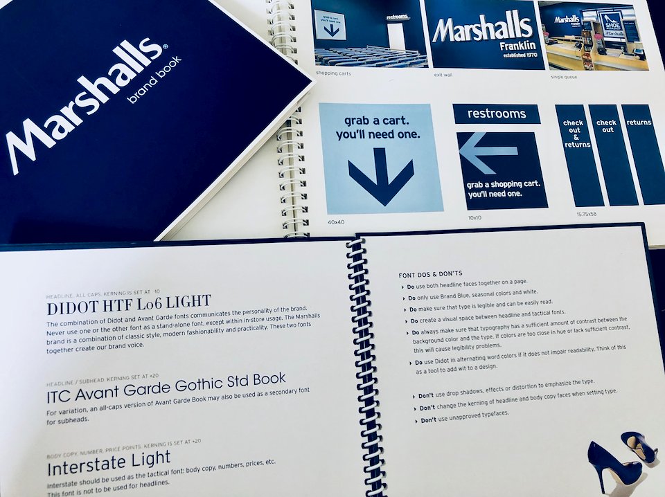
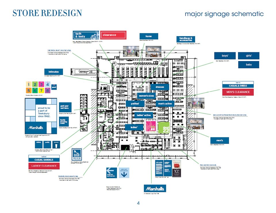
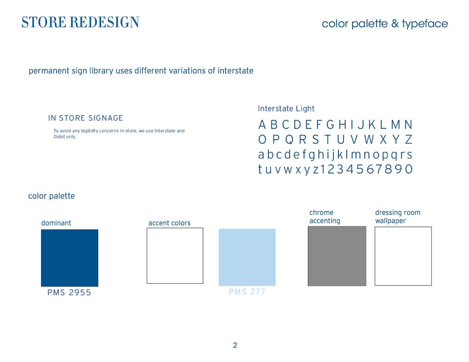
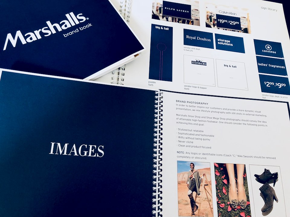
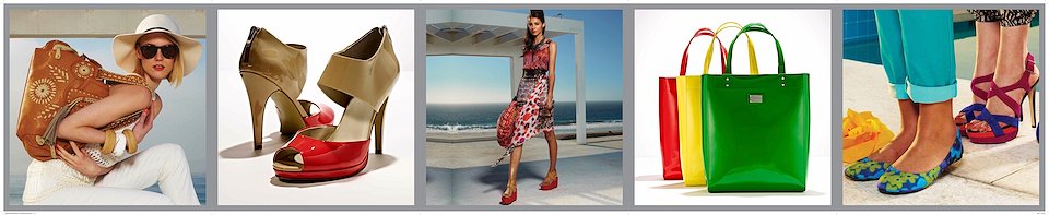
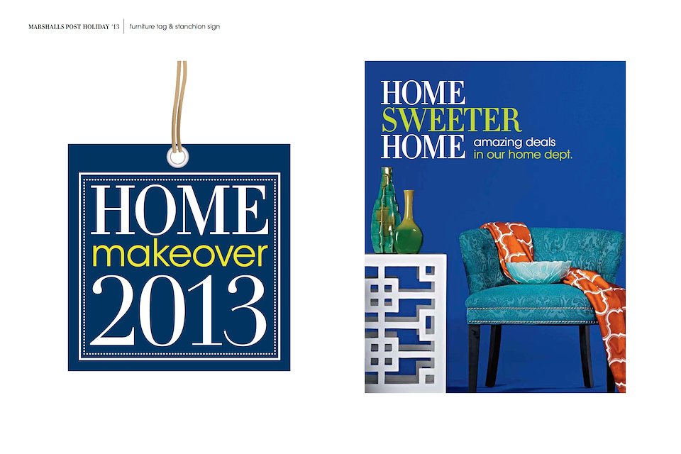
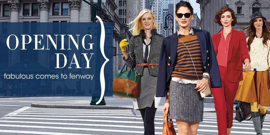
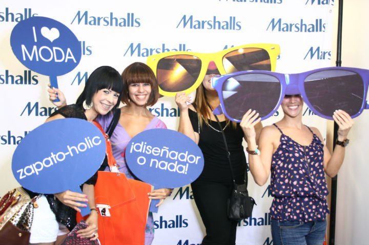
The Marshalls store needed a face lift (so it wouldn’t look like a throwback from the '70s anymore) to match the efforts of the Marshalls brand in becoming more relevant and upscale.
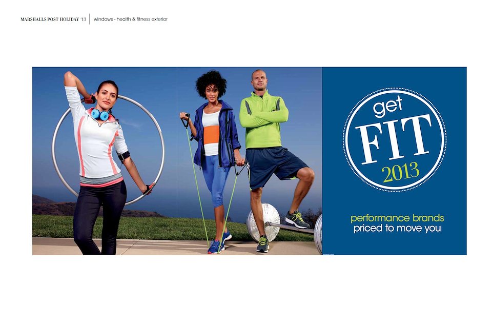
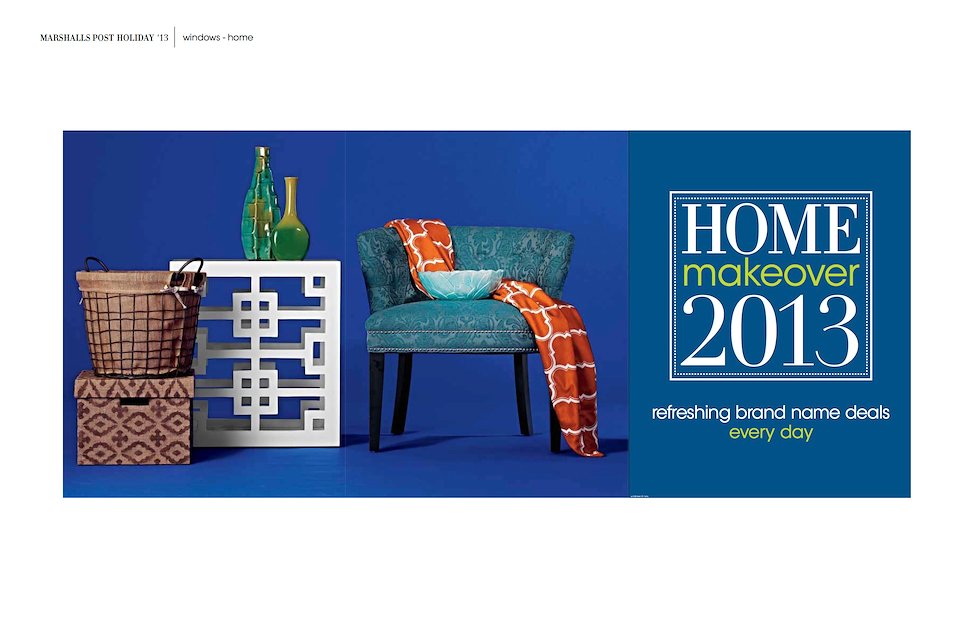
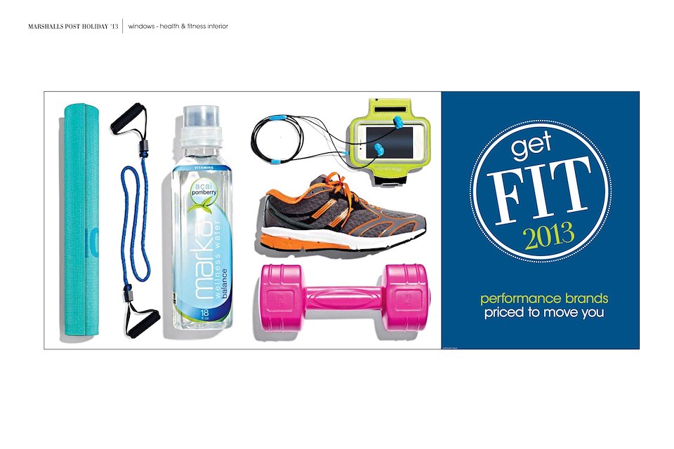
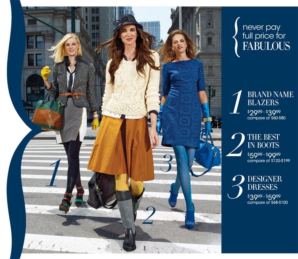
By simplifying and standardizing the type used in store signage, using high end seasonal photography, and updating the brand’s signature blue color — among other things — our team sought to make the new store experience just a bit more modern and contemporary.
These efforts set the basic visual foundation from which subsequent seasonal, promotional, and point-of-sale sign packages could be developed and displayed.
-
For Marshalls
Up Next: